The Zinq Logo
Our wordmark is the core brand asset. The gradient "Zinq ⚡" lockup should appear in all primary touchpoints.
Always maintain a minimum clear space of 1× the cap-height around the logo on all sides. This is represented by "X" below.
Logo Misuse — Don't do these
Color Palette
Our palette is bold, energetic, and fun — built around a purple-to-pink gradient core with cyan and yellow accents. Click any hex code to copy it.
Typography
Zinq uses the native system font stack — this keeps things fast, familiar, and platform-appropriate. SF Pro on iOS, Roboto on Android, and Segoe UI on Windows.
Icons & Emoji
Emoji are first-class citizens of the Zinq brand — they carry personality, energy, and cultural context. Use them generously but intentionally.
Category Emoji Set
Player Avatar Emoji Set
Auto-generated player names pair an adjective + an animal from this pool. The emoji follows the animal name in the display string.
App Icon
The app icon uses "Z⚡" on the primary gradient background. Rounded corners follow the iOS squircle radius at every size.
Icon Specifications
Tone of Voice
Zinq is a game, not a productivity tool. Every word should feel like it came from a witty friend — not a corporate chatbot.
Do vs. Don't — Writing Examples
UI Components
Core interaction patterns used throughout the Zinq app. Each component follows the brand's rounded, energetic aesthetic.
Gradient tinted background, purple category badge, gradient fill on selected state
Emerald green background with pulsing glow effect on the correct option
Red on wrong pick + horizontal shake animation. Correct answer stays revealed.
Color transitions from purple → yellow → red as time runs out, building urgency
Motion & Animation
Animation in Zinq should feel playful and responsive — like a game, not a document. Every interaction should be satisfying and fast.
confetti: 12 particles, 600ms burst
duration 400ms · ease-in-out
duration ~300ms
color: purple → yellow → red
pulse at <5s: scale 1.0 → 1.02, 500ms loop
duration 800ms · ease-out cubic
options stagger: 60ms between each
opacity: 0 → 1 · 400ms
duration 5s · ease-in-out · infinite
Accessibility — Reduced Motion
Always respect the prefers-reduced-motion system setting. When active, replace spring animations with instant state changes and remove confetti, floating, and pulsing effects. Transitions that communicate state (correct / wrong / timer) should remain but become instant.
iOS & Android
Both platforms share the same design language — gradient borders, colored stat cards, emoji avatars, and playful animations.
iOS (iPhone 17 Pro)
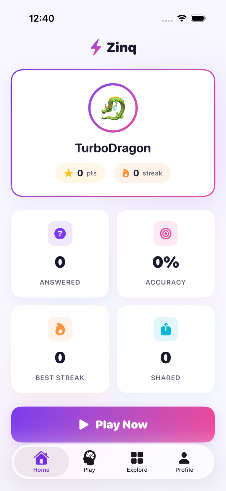
Home
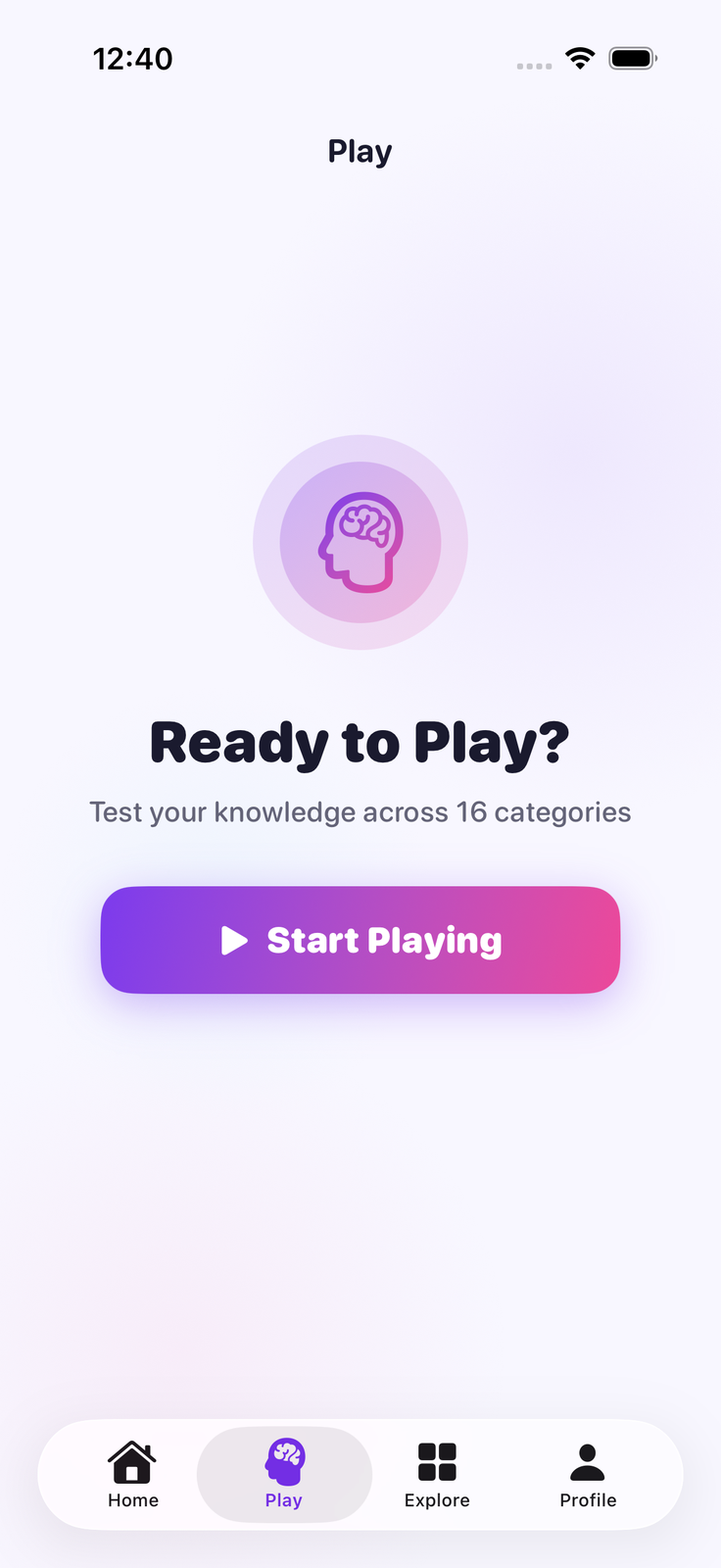
Play
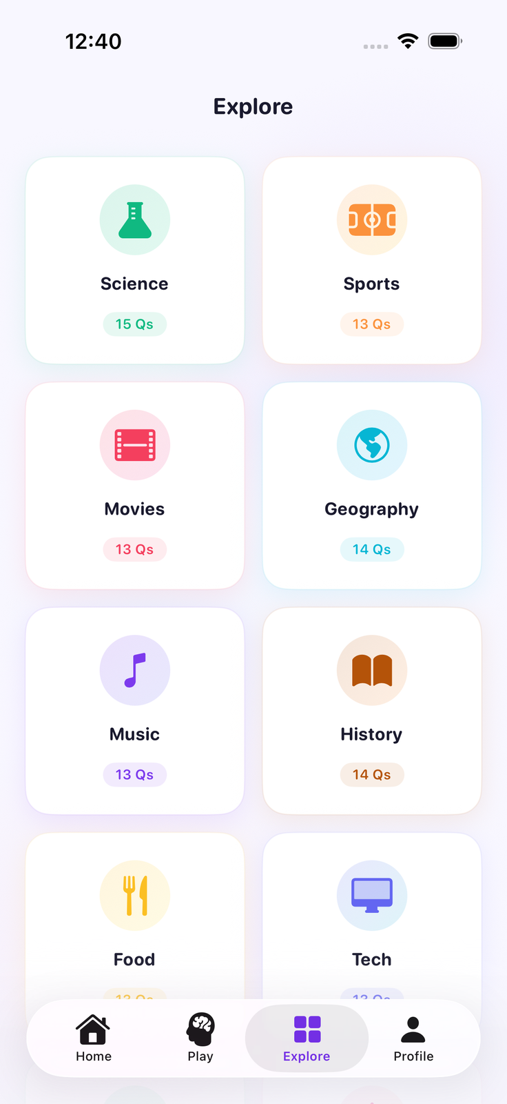
Explore
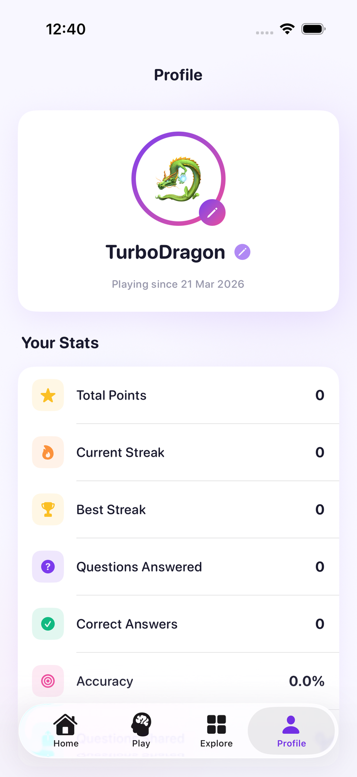
Profile
Android (Pixel)

Home

Play
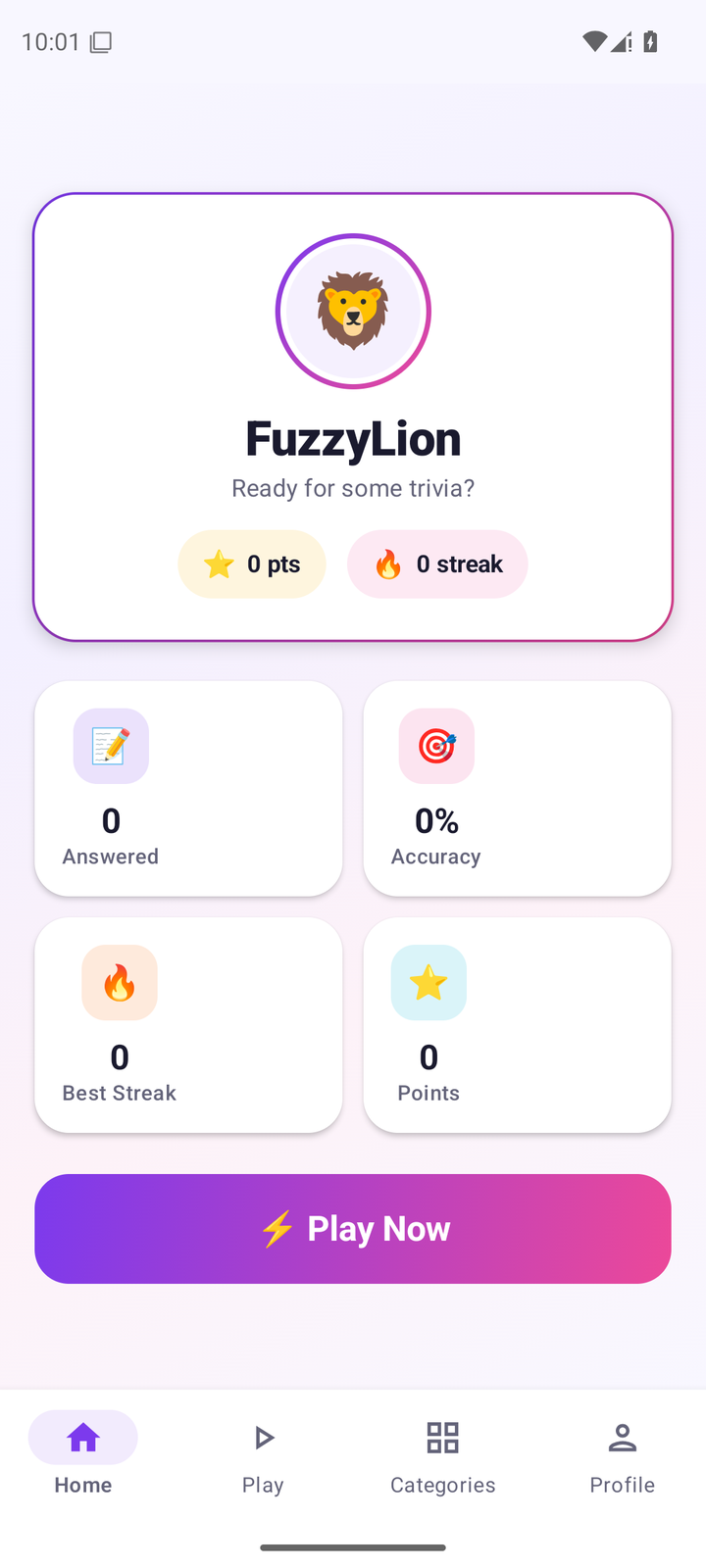
Categories

Profile
Download Assets
Brand assets for press, partners, and third-party use. All assets are available in the formats below. Coming soon.